For My Voucher Codes, a vouchers and discounts website, the task was to review the current mega-menu and redesign it to be consistent and have a better structure, as well as finding opportunities to generate new revenue through paid advertisements.
My role was to first review the current menu and identify opportunities. Then to wireframe and design a potential new mega-menu that could be presented to senior stakeholders. I was responsible for determining the overall design direction of the project
Wireframes
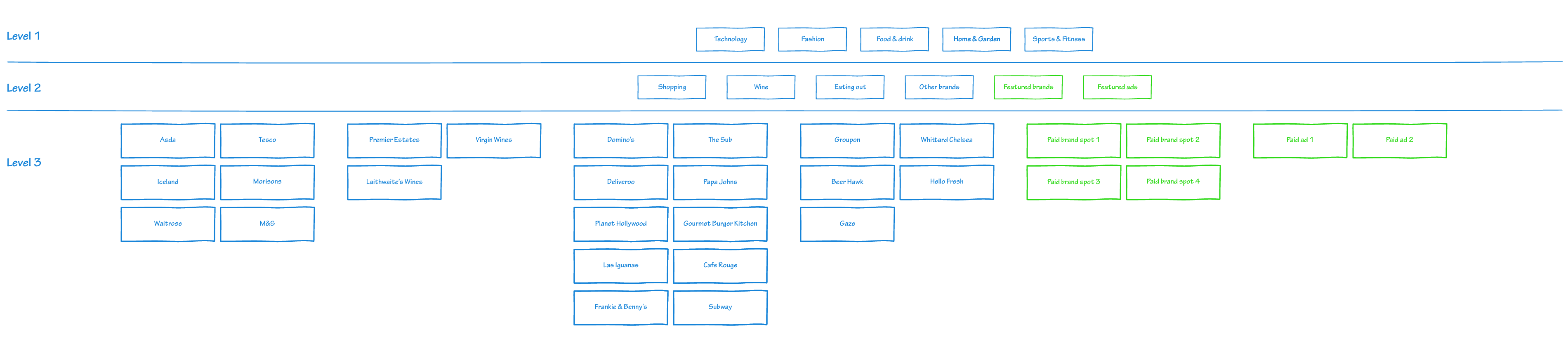
Creating a new mega-menu was identified as a business need, as it required a clearer navigation structure and hierarchy, as well as being able to feature brands in 2 ways (featured brands and featured ads). From a user perspective, there was not a lot of data, with no analytics or insights provided to see what is working and what is not.
The next step was competitor research, to see what others in the industry – such as Voucher Cloud and Groupon – are doing and how they categorise items. Rather than trying to reinvent the wheel and potentially confuse users with a totally different way of organising content, it is normally good practice to follow others unless there is a clear problem.
As well as competitor research, I empathised with the users to understand their goals, needs, motivations and frustrations. To do this, I tried using the website as a customer, so finding discounts or voucher codes for products that I needed to buy and then navigating through the discount website to find the correct brand.
A physical version of this task would be going to a supermarket with a list of items and then navigating to where we expect those items. For example, you expect the frozen goods to be at the end of the supermarket journey, and usually the grab and go area is at the front of the store. We have mental models of how we expect the world to work and this applies digitally as well. These web conventions make life easier for users because they don’t have to constantly figure out what things are and how they’re supposed to work as they go from site to site.
Proto-Personas
With a lack of qualitative and quantitative research, it meant that I needed to create proto-personas. A proto-persona is similar to a persona where you have a one-page sheet that typically consists of the user needs, motivations, frustrations, digital confidence and anything else that helps you keep focused on designing your service to meet the needs of that user. But the difference is a proto-persona is based on assumptions and guesses, which as you can imagine has its flaws (in that even the most educated guesses may not be completely accurate). Even so, it does create conversations and help stakeholders focus on the users, not themselves and what they would like to see.
Design
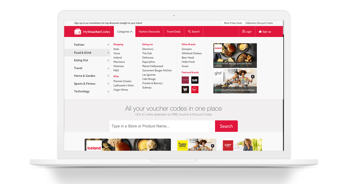
Once the wireframe had been put together with influence from competitors it was then ready to progress to design. The design was done in Sketch, using the brand guidelines. The designs were then shared with stakeholders on InVision. Feedback was collected and the iteration continued until all stakeholders were happy with the designs.
Key points of the redesign were:
- Splitting different brands out into subcategories
- Introducing a new paid ad area called “featured brands” which had a small thumbnail icon space of up to 4 placements
- Introducing a new paid ad area for offers, with up to 2 placements
Conclusion
As well as a clearer structure by placing brands within subcategories and an information architecture review, the new mega-menu design met the needs of the business. The menu follows other competitors websites in terms of its structure but fundamentally keeps it in line with the branding of the website. Two new revenue options have been discovered by having a small paid brand area as well as two large paid ad placements.