Changing the cursor property using CSS

Last updated on
The cursor property controls the styling of the mouse cursor that is shown to the user when the mouse is pointing on an element. This CSS property is only for devices that use a mouse so it wouldn’t apply to a phone or a tablet because there is no cursor.
Using the correct type of cursors is becoming more important than ever with the increase in web applications. From a UX perspective it is essential to utilise this property to convey meaning to the user through visual feedback cues.
As well as the standard cursors there is custom option which we’ll look at next.
How do I add a custom cursor in CSS?
By using the url() value we can display a custom image. You can also add a second custom file with a comma-seperated list and then finally end this list with a generic cusor such as pointer, default or auto, as shown in the example below:
.customcursor {
   cursor: url("cursor.svg"),url("custom.cur") auto;
}
There are some things to bear in mind when using custom images in CSS and to have maximum browser support, which are:
- Firefox, Chrome and Safari require an image — I’d recommend a 24-bit alpha-transparent PNG.
- Firefox also requires a second non-URL fallback value.
- It’s not supported in Opera.
- x and y are optional properties in Firefox, Chrome and Safari which define the precise pointer position from the top-left of the graphic. If omitted, 0 0 is assumed.
- Internet Explorer requires a Windows cursor file (.cur).
Can I use an SVG graphic?
Yes, you can use SVG format for a cursor as well as other image formats that are supported by Gecko like PNG, GIF, JPG, CUR and more. Your custom image must not be larger than 128x128px.
If it is larger than that the image is ignored by the browser. However, you should aim for it to be 32×32 to ensure it’s supported in as many operating systems and platforms as possible.
All of the cursors
There are over 32 different types you can use, here is a list of all the cusors as well as a demo on CodePen to preview each type:
Example using CodePen
[codepen_embed height=”500″ theme_id=”0″ slug_hash=”wGKNgp” default_tab=”result” user=”michaelgearon”]See the Pen CSS – Cursors by Michael Gearon (@michaelgearon) on CodePen.[/codepen_embed]
CSS values
.auto            { cursor: auto; }
.default         { cursor: default; }
.none            { cursor: none; }
.context-menu    { cursor: context-menu; }
.help            { cursor: help; }
.pointer         { cursor: pointer; }
.progress        { cursor: progress; }
.wait            { cursor: wait; }
.cell            { cursor: cell; }
.crosshair       { cursor: crosshair; }
.text            { cursor: text; }
.vertical-text   { cursor: vertical-text; }
.alias           { cursor: alias; }
.copy            { cursor: copy; }
.move            { cursor: move; }
.no-drop         { cursor: no-drop; }
.not-allowed     { cursor: not-allowed; }
.all-scroll      { cursor: all-scroll; }
Resize cursors
.col-resize      { cursor: col-resize; }
.row-resize      { cursor: row-resize; }
.n-resize        { cursor: n-resize; }
.e-resize        { cursor: e-resize; }
.s-resize        { cursor: s-resize; }
.w-resize        { cursor: w-resize; }
.ns-resize       { cursor: ns-resize; }
.ew-resize       { cursor: ew-resize; }
.ne-resize       { cursor: ne-resize; }
.nw-resize       { cursor: nw-resize; }
.se-resize       { cursor: se-resize; }
.sw-resize       { cursor: sw-resize; }
.nesw-resize     { cursor: nesw-resize; }
.nwse-resize     { cursor: nwse-resize; }
Browser-Specific Cursors
Additionally there is a few browser specific options which are:
-webkit-zoom-in
-webkit-zoom-out
-webkit-zoom-grab
-webkit-zoom-grabbing
List of CSS cursors
General purpose
auto: User-agent (UA) decides what to display based on the context, for example it is auto behaves as ‘text’ when over selectable text or editable elements and then ‘default’ otherwise
default: the platform determine the default cursor, typically this is an arrow
none: no cursor is shown for the element
Links and status
context-menu: can be used when an object is under the cursor. Normally the render cursor is an arrow with a small menu graphic next to the arrow.
help: similar styling to the context-menu but with a question mark or a ballon next to the arrow.
pointer: typically used when there is a link, the pointer looks like a hand with the index finger pointing.
progress: indicating that something is happening or being processed but you can still use the web application.
The wait is different as that is saying to the user to stop and wait for the action to finish. The progress renders as a spinning beach ball on Mac or an arrow with a watch or hourglass on Windows.
wait: used when the web application is busy and needs to tell the user to wait until the process has finished. Typically rendered as a watch or hourglass.
Selection
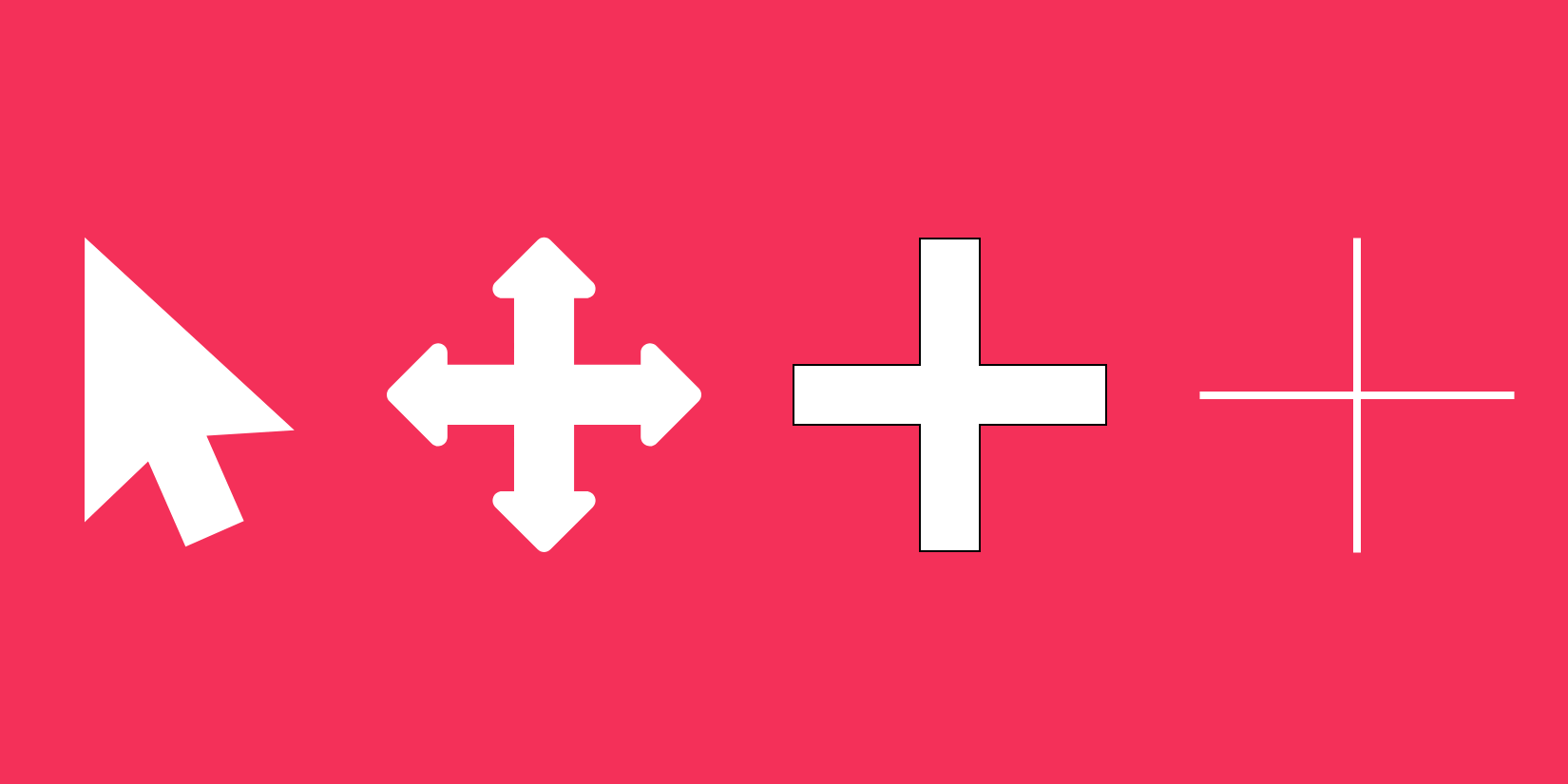
cell: a thick plus-sign with a dot in the middle, it shows that a cell or set of cells may be selected.
crosshair: a basic crosshair, normally used to indicate a two dimensional bitmap selection mode.
text: one of the most used cursor types, it indicates to the user the text may be selected.
vertical-text: the same as the text cursor type but this is used for vertical-text.
Drag and drop
allias: rendered as an arrow with a small curved arrow next to it. It indicates an alias of/shortcut to something is to be created.
copy: the copy cursor type can show something can be copied, it is rendered as an arrow with a small plus sign next to it.
move: something can be moved on the screen
no-drop: an item may not be dropped at the curent location
not-allowed: the requested action will not be carried out, shown as a circle with a line through it in red
grab: shown as a hand grabbing something it shows something can be grabbed and to be dragged or moved
grabbing: whilst grabbing something the hand looks like it is holding the object
Resizing and scrolling
e-resize, n-resize, ne-resize, s-resize, se-resize, sw-resize, w-resize: something on each edge can be moved
ew-resize, ns-resize, nesw-resize, nwse-resize: indicated a bidirectional resize cursor
col-resize: indicates that the item/column can be resized horizontally
row-resize: indicates that the item/row can be resized vertically
all-scroll: indicates that something can be scrolled in any direction
Zooming
zoom-in, zoom-out: indicates that something can be zommed in or out, normally shown as a magnifying glass
Related reading
Written by
Senior Interaction Designer and Co-Author to Tiny CSS Projects