border-radius CSS property

Last updated on
The theory behind rounding corners is that they take less cognitive effort to process. By rounding corners not only is it easier for us to process but they look more appealing on the eye. The idea behind this is that we associate sharp shapes with danger, and softer shapes are friendly and safe. The bias behind this is known as the contour bias, where we favour objects with contours over objects that are sharp.
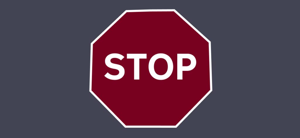
An example of this is a stop sign, a stop sign (shown below) has sharp edges which does not look natural, it stands out against organic, natural shapes that are softer. That’s why when you are designing websites and applications error messages or messages that you want the user to see should be formatted in boxes with sharp edges but in cases where you want the user to focus on the content or make it feel lighter then rounded corners may be your best option.
The border-radius property can be used to create rounded corners on elements. The value of property can either be in length or percentage units. You can animate the radius as well using a calc() function, percentage or length value.
The border radius property is shorthand for border-top-left-radius, border-top-right-radius, border-bottom-left-radius and border-bottom-right-radius. As with writing the padding & margin shorthand, border-radius goes clockwise, from top left, the top right, bottom left and finishing on the bottom right.
Long form border-radius examples
.round-box{
 border-top-left-radius: 50%;
 border-top-right-radius: 50%;
 border-bottom-left-radius: 50%;
 border-bottom-right-radius: 50%;
}
Shorthand border-radius examples
To set all 4 corners with the same value you need to declare one value:
.round-box{
 border-radius: 10px;
}
If there are 3 values in the declaration then the first value sets the top left, the second value is for the top right and bottom left and the third value is the bottom right:
.round-box{
 border-radius: 10px 40px 80px;
}
To set the top left and the bottom right the same value and the top right and bottom left a different value you would use two values:
.round-box-two{
border-radius: 40% 0;
}
If you wanted to have a rounded circle you can use the border-radius 50% on a square element to create a circle, for example:
.round-box{
border-radius: 50%;
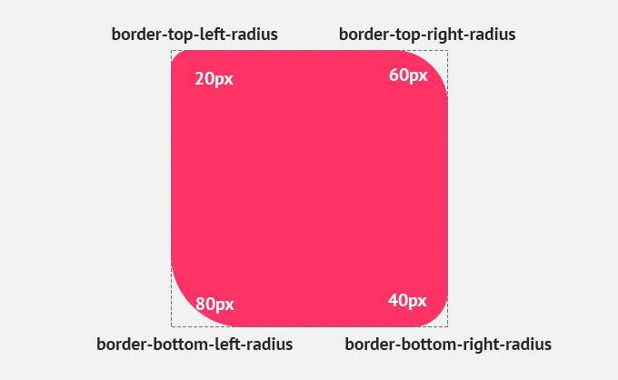
}If you wanted to have different radius on each corner then you can do this:
.round-box{
 border-radius: 20px 40px 60px 80px
}
The output would be:
- top-left: 20px
- top-right: 40px
- bottom-right: 60px
- bottom-left: 80px
Optional horizontal and vertical values
It is possible in the property to have a different value for the horizontal radius to the vertical radius. As with above you can define the values in pixels (px) or percentages (%). The values before the slash sets the horizontal values, the values after the slash is the vertical values.
.round-box{
 border-radius: 10px / 50px;
}
Clipping
Sometimes you will notice the background color or content falling outside of the border if the border is curved. Using the background-clip property this can stop this from happening:
.round-box{
 border-radius: 10px / 50px;
 -moz-background-clip: padding;
 -webkit-background-clip: padding-box;
 background-clip: padding-box
}
Border radius generator
There is an online tool that allows you to generates the border-radius for you. By default it is does add vendor prefix’s but as we will see next you may not need vendor prefix’s.
Browser support
Browser support is good for border-radius, it has been supported in all main browsers (for example it is supported all the way back to Internet Explorer version 9) for many years and does not require any prefix’s such as -webkit- and -moz-.
Resources
Further reading
You can use this property with other properties such as border and box shadow. Here are a few other guides you can read on CSS:
- !important rule in CSS: when and how to use it
- How to disable text selection using CSS
- CSS :focus-within pseduo-class
Written by
Senior Interaction Designer and Co-Author to Tiny CSS Projects