Odds and Ends #1 – Typography
‘Odds and Ends’ will be a weekly post containing (in my humble opinion) some of the best blog posts, videos and tutorials on the web. It will cover a wide range of topics centred around, but not limited to, my interest in web design and development. This week we will look at some of the best typography blog posts, and how we can create responsive, accessible type that is easily read.
Readable, Fluid Type With Basic CSS Smarts
This Type Cast blog post gives pointers on how to produce good typography, covering area’s such as choosing your font, font sizes using ems, and fancy CSS columns.
How We Read
Taken from the first chapter of the new book ‘On Web Typography’ by Jason Santa Maria, this blog post looks at how we actually read and includes some great tips on improving readability. This book is definitely on my wish list.
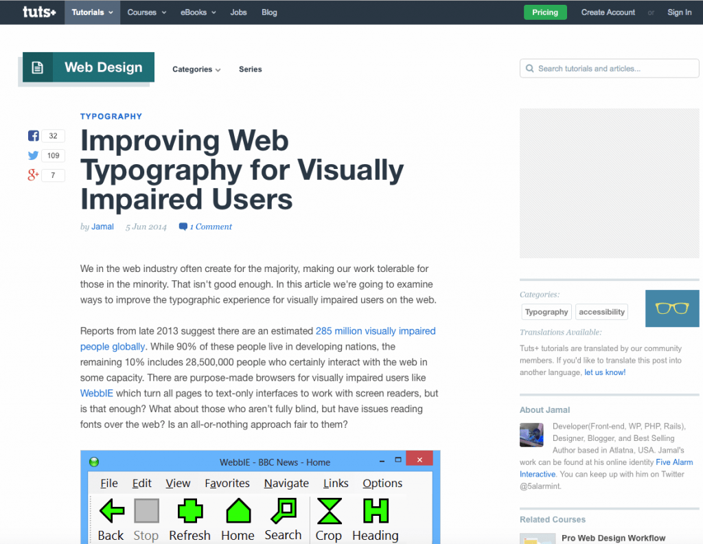
Improving Web Typography for Visually Impaired Users
It is good to create beautiful web typography, but we should also consider accessibility for those who might have impaired vision. This guide by tuts+ provides insightful information on little things we can do to make a big difference.
Techniques for Responsive Typography
This post by Sara Soueidnn on Codedrops looks in detail at responsive typography. Topics covered are; using JQUERY to produce large responsive headlines, using the CSS @font-face rule, font colour accessibility and lots more.

Written by
Senior Interaction Designer and Co-Author to Tiny CSS Projects


