CSS multiple column layout module

Last updated on
CSS columns give us, the web designers the ability to flow content between multi-columns which adjusts depending on the viewport size. This module has plenty of options to produce layouts similar to print design that we see in magazines and newspapers. This post will look in depth into the module, and demonstrate a layout using both the multi-column layout and the picture element.
The Properties for CSS columns
Column Count
The column-count property declares that the content should be laid out in a column. The value is amount of columns you need, so column-count: 2 would be two columns.

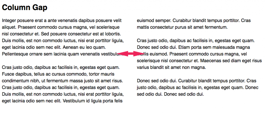
Column Gap
The column-gap property declares the amount of space between each column.
Column Rule
The column-rule is the shorthand property which sets the width, style, and color of the rule between columns. To break it down into it’s individual properties it would be:
element{
  column-rule-width;
  column-rule-style;
  column-rule-color;
}
As demonstrated by that pink line between the columns.

Column Span
The column-span will span the content across the amount of columns you need an example could be a header. In the case below the title is aligned centred, then spans across all three columns.

Media quires
Media quires are useful although not entirely needed, because the columns will flow naturally to the browser width there is no problem. However if you view the columns on a phone and there is 4 columns this could look very ugly. Media quires can help us out here by using something similar to @media all and (min-width: 900px) we could flick between a traditional layout and a multi-column layout. The other option is to use media quires to change based on the height as well as width, because it could be quite annoying for a user to scroll down and then back up to the top.
Demonstration
This demonstration presents the options possible using the column properties. Also I have experimented with the use of the picture element, with the that you could deliver a layout suitable for most devices. The picture element works in a small amount of browser versions.
See the Pen Columns by Michael Gearon (@michaelgearon) on CodePen.
Browser Support
Browser support is good for CSS3 multiple columns layout, for Internet Explorer it is supported in 10 and above. For Chrome, Firefox and Safari it is fully supported without prefix.
Conclusion
Multi-column layout helps web designers produce print layouts with an extensive list of properties. The problem of responsive design and making it look good on all devices can be fixed using media quires, and support across browsers is good. I personally think this module is an exciting part of CSS3.
Further Reading
More CSS Guides
Written by
Senior Interaction Designer and Co-Author to Tiny CSS Projects